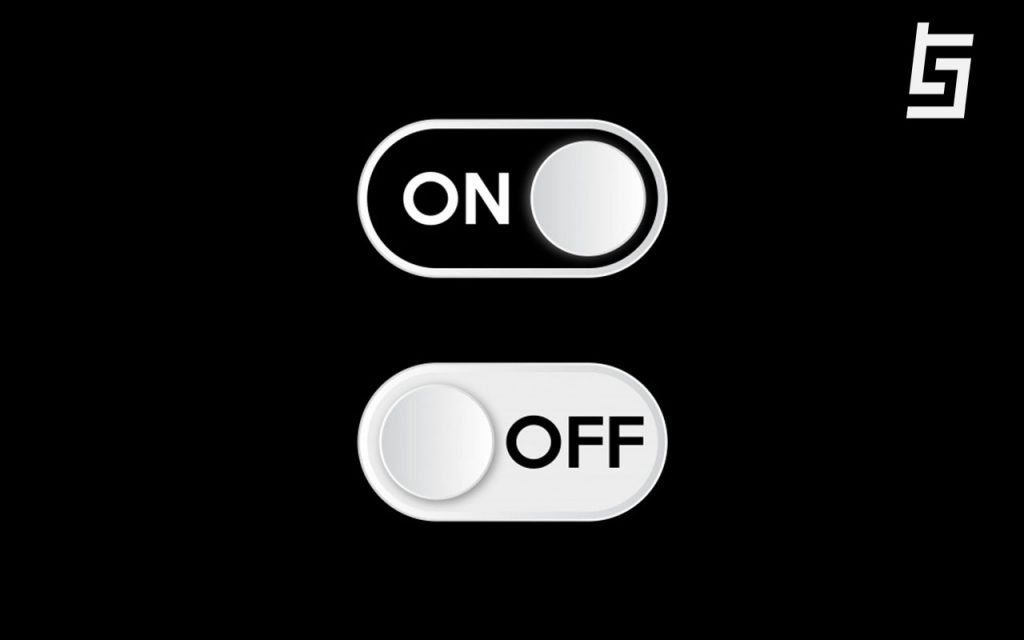
The dark mode is gaining a lot of buzzes lately as more and more apps are encouraging it. Nowadays programs and apps are found to feature dark modes in their user interface. The devices including phones and computers also have started rolling out a built-in night mode in them. There are icon toggles in phones that are used to turn the theme of a dark mode on or off.
How did Dark Mode Come into Popularity?
Google has allegedly shown how having a prevalent white screen can utilize up to six times as much battery as a prevalent black one on the primary pixel. The majority of smartphones these days have OLED screens which means they display light-emitting diodes, which emit light by themselves so that there isn’t any need for a backlight and which makes the pixels illuminate themselves. In this way having fewer illuminated pixels in dark-themed UI means extended battery life. The reason why dark mode has been pushed forward can probably be devices that are constantly fighting poor battery life and are in need to amplify the battery life.
Emitted Light and its Effects
According to Goethe’s theory of colors where he talks about the physiological effect of colors, he reveals how with a black background the lettering inclines to distinguish itself over and how the color black is among fewer surfaces that let other colored text to function great conjointly. Light color text is complemented in the dark background and that usually makes us easy to read and switching to this mode can mitigate the chances of experiencing digital eye strain.
The data from Mental Health America shows how light is perhaps the strongest environmental influence in circadian rhythm, with blue light creating the strongest response to this cycle. Consequently, blue light emitted from screens is mentioned to disrupt the sleep cycle or patterns because our brain confuses the blue light for daylight.
But, does Dark Mode solve everything?
Despite dark mode having its perks and delivering many benefits, it still has some issues to resolve. Since lighter tones have better readability on dark themes, saturated colors that visually vibrate against a dark background should be avoided in dark themes. The dark themes might not be quite functional if one has an older technology device because it wouldn’t be able to complement the device’s illuminance.
American Optometric Association illustrates how pure black backgrounds with white fonts can sometimes be tough to read for those people who have astigmatism and might provoke their condition and can also cause visual distortion for some other people who have trouble with this color synchronization making them squint in an attempt to read things. Modest color accents must be applied in dark theme UI so that the majority of space is focused on the dark surface in order to promote accessibility. There also needs to be more flexibility and usability in a dark-themed UI for it to be absolutely practical.
Also, Read || How to Break into Tech Jobs Without Starting Over
Verdict
Despite having some limitations, the perks of the dark mode go on to dominate its limitations. A human subject study conducted by ResearchGate on dark color schemes shows how people have higher visual acuteness than the light mode and how they have significantly lower visual fatigue in dark mode then compared to light mode. The study also demonstrated how people feel visually comfortable with the dark mode and it is generally more comfortable to read white texts in a black background as opposed to black text in a white background.
The dark mode also decreases the luminance emitted by device screens while still meeting the color variation ratios since dark surfaces occupy a greater portion of UI and strengthen visibility in vile ambient lighting.
There are many perks of dark mode and some limitations it brings along with its benefits which need to be resolved. What are your opinions on dark themes? And do you prefer your devices in this mode?


