Not sure but on 6/12/2023 Namaste Pay pushed a new update, with a completely new and revamped UI /UX. The new UI of the namaste pay looks wholly stunning, completely new, and unique in the context of Nepal. With the new UI, Namaste Pay has ultimately looked different.

According to Namaste Pay and from our observation what’s unique in Namaste Pay, Let’s discuss one by one.
1. Refreshed User Interface
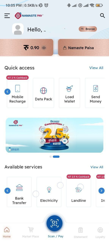
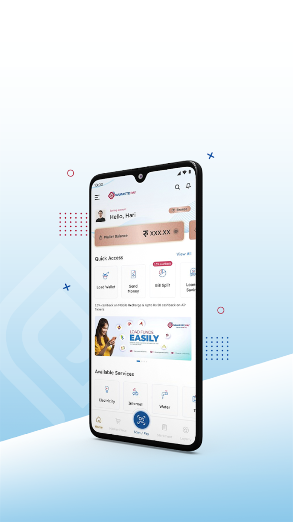
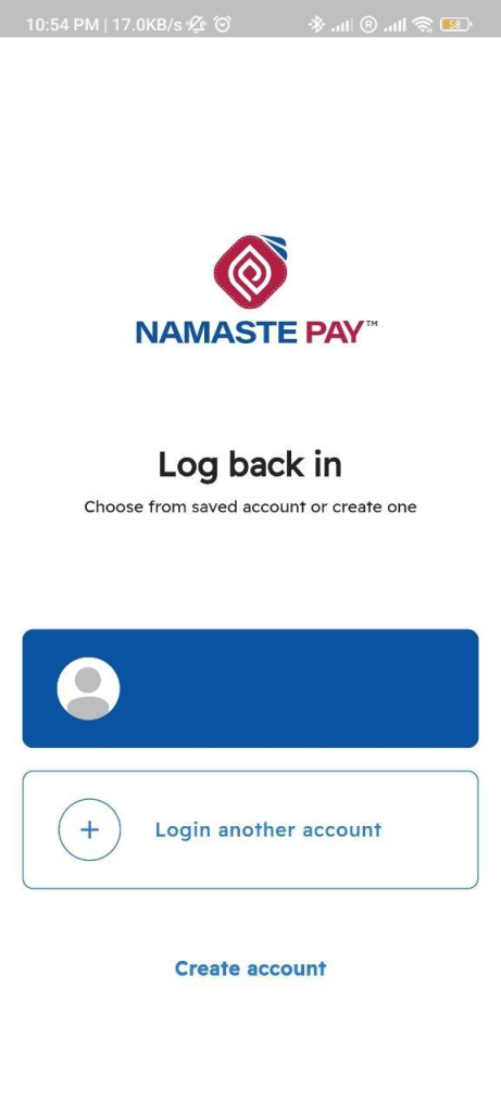
Yes as per what they have mentioned User Interface is completely stunning, and looks different. you can feel the same with the below screenshots,
2. Redesigned Navigation
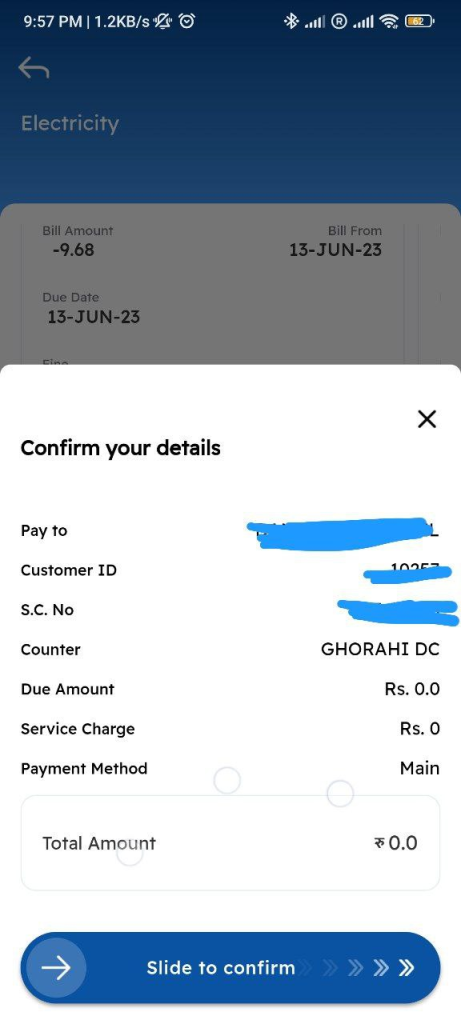
Now Namaste Pay has changed some navigation also, as from direct click to they have converted into a slide button, or slide option you can say, Now onwards you can pay by sliding the confirm button,
3. Enhanced Performance
We are not sure about the exact because we can’t define the performance by looking outside but it looks like they are dependent on several parties you can say in microservices that it is redirecting to multiple screens or directly new apps so it seems microservices are enabled so it might have increased the performance, so it will help your day to day life usage and it will help to make the seamless payment.
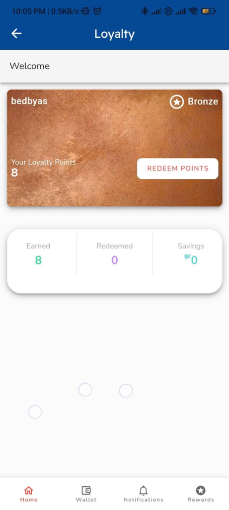
For example, you can see this loyalty option this looks like a completely new app so, it seem like a completely new web app if the app server will handle day-to-day services only then it will help user to experience a seamless experience in everything. We hope it has been really enhanced.
You will love to read : Namaste Pay launches “Split Bill” option for bill payments for its customers
4. Personalization Options
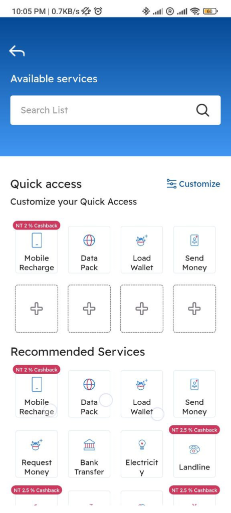
Yes as they have claimed they have enabled the option to customize accordingly to your needed services, Which looks nice if the user can really use it properly and if they become familiar with the system or you can say with the new update.
5. Loyalty Program
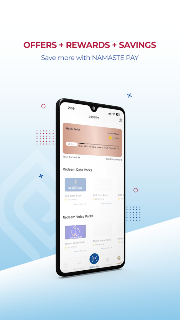
Namaste Pay has launched a loyalty program but it has not been mentioned in-app update summary which might be due to the loyalty system not being completed yet so they are not confident enough to mention it in the update summary of google play, now you will see 2 screen in which one from the app and one from which UI they have shared in the internet.

Our Verdict
With the new update, Namaste Pay tries something new but user onboarding is a bit hard after the new update I mean existing users, which should be a smooth transaction but it wouldn’t happen, but it is a nice try. But we are not expecting Namaste Pay to promote multiple users, which makes us a bit sad and unhappy, multiple accounts in one phone is not needed in real life so it might increase the fraudulent transaction also so we request the team to review it once.
Oops, I forgot to write about UX Now it’s your duty to determine and gives suggestion To Namaste Pay, To experience this you should update the app.

